
Whether a bookcase, a hutch, a cabinet, or a built in, being creative with the interior is a great way to add a little pizzazz to the space and to the objects which one wishes to display. Sometimes we might think of something simple, maybe even a tad bland in wood tones, but here are some great examples to show how using either a contrast color, a texture or a reflective surface can add life to the space to showcase precious objects or beloved books.
Complimentary colors working perfectly together.


Source Unknown …..anyone know?
Shades of the sea, whether a blue, grey, turquoise, or emerald, anything reminiscent of the sea, all of these colors work well. They can be contrasted with color, or a monochromatic fashion, paired with shades of white or even wood tones. 


Source forgotten (I inserted images awhile ago, and can’t believe I forgot the source) if anyone knows, please let me know.

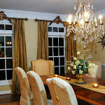
 House Beautiful as seen over at the super fabulous blog, Simplified Bee
  S
S
Green….vibrant, punchy, soothing, or a relaxing green, either way, they work well in creating the ideal setting. 
The strong contrast of the lime with the white along with the black matted framed intaglios make this arrangement sing with a burst of color making it one very happy place to be. 
Shells, books and vintage sailor's shell art which are set off beautifully in creamy white and a soft pale green. 
Colorful & Cheerful 
Neutrals….and a dark contrast….everything always looks good in black and/or a rich brown (in my opinion :)). 

Reflective surfaces……mirrors & shimmering surfaces. Mirrors are a great way to reflect more light into the room and visually expand the space. 


Even in small cabinets such as this one, with a silver leaf it adds a lot of sparkle. Martha Stewart
Bold & Beautiful
Grass cloth paper on the walls paired with black and reds on the built ins and throughout the room add warmth. 


So remember to…….. Cover Your Cases.
Papered: a good rule of thumb is to use small repetitive prints and paisleys.
Painted: shelves should be a deeper shade to suggest shadow and depth.
If you need assistance in figuring out what would be the best backdrop in your space for your favorite treasures, consider hiring a professional to find that perfect combination.


Laura, each and every time you take on a blog... and I read it... I want to tackle whatever it is you have just blogged on. Now I want to re-do my bookcases. Truth be told, I have wanted to re-organize and spruce them up for a while, but I feel like sending you this comment and immediately getting started. Like I always say... keep 'em coming. Love every thing you blog about :)
ReplyDeleteWonderful and thank you so much for so much inspiration!
ReplyDeleteI just popped by for some inspiration. Your posts never disappoint. I was honored to have a couple of my projects included! Thank you Laura!!!
ReplyDeletexo
Brooke
Thanks for introducing me to your blog, it's wonderful! That first image really caught my eye, those are my colors. I'm ready to repaint my wooden cabinets in that great blue and orange combo. And thank you SO much for sharing our work on your blog!
ReplyDeleteBest,
Kellie
Laura,
ReplyDeletethis is a wonderful gallery.. What a wonderful selection.. the first image with gray bookcase and orange interior is so striking.. but my faves are the ones with with blues and greens..
dreamy.. I am going to share this post with my f/b friends..;-)
I really like to paint the back of bookshelves and have done so in a few of my clients' homes. Great post.
ReplyDeleteValerie
I enjoyed this post. I also featured the same room, from Martha Stewart Living, on a previous blog of mine. Love the combination of colors - really pops the architecture but also makes for a less serious room.
ReplyDeleteYou have a gift for putting things together- even this collection of pictures. I am inspired to do some serious painting/reorganizing this summer!
ReplyDelete:)
I love this post, these are such great ideas to add happy to bookshelves!
ReplyDeleteHey Laura! Great post! I'm not an orange fan, but that first bookcase with the grey/orange combo catches my eye. I love, love, love having a colored backdrop to bookcases.... I recommend it to everyone! Hope you are well! :)
ReplyDeleteLaura,
ReplyDeleteWhat a great post. Very pretty & informative. I love your blog and look forward to adding it to my favorite new stops for inspiration.
Thanks for connecting with me on fb.
Lisa